FOC – The Barbaric Cutoff is Here – Join Us!

Final Order Cutoff is the last chance for comic retailers to adjust their order numbers on books heading to print.
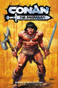
So, with that in mind, please allow me to beat the drum here one last time about CONAN THE BARBARIAN #1, arriving in stores on Wednesday, July 26th.
This week is your last chance to pre-order a copy from your favorite comic shop and be guaranteed a copy will be waiting for you.
Our art team (Rob De La Torre, José Villarrubia, Dean White, Richard Starkings and the many incredible artists lending their skill to variant covers) has put together the Hyborian adventure of my dreams, delivering something really special on each and every page. This is one of the highest profile launches of my writing career and it would mean a lot to me if you pre-ordered a copy of #1, added the series to your pull box subscriptions, and/or let other people know that Heroic Signatures and Titan Comics are bringing the goods.
Thank you, as always, for your support!
Dramatic VS Literal Color
Looking at some recent comics and I notice a lot of cookie cutter color palettes: blue sky, green grass, brown bark, etc. The rendering is okay, but the dramatic impact is lacking.
Even when panels all take place in the same scene under the same lighting conditions, colorists should try to vary things up and improve the storytelling by using dramatic color.
Check this old school example from Uncanny X-Men #275

Pencils by Jim Lee. Inks by Scott Williams. Colors by Glynis Oliver and Joe Rosas. Lettering by Tom Orzechowski.
Notice how the yellow and blue KRUNCH panel stands out even though the palette choice isn’t ‘real’? If that panel was colored like others on the page (with a green T-Rex) it would be way less potent.

Here’s another page from the same issue:

That top panel’s cool color palette pushes it away from us visually and makes it less important than what’s below, creating a ‘fade out’ feel between scenes and locations. If the characters and environment were all rendered using local/true colors it could end up quite busy and readers wouldn’t know where to focus.
Digital tools are convenient, but some colorists seem to think that lots of rendering and realistic lighting = higher quality and that’s not always the case when it comes to successful communication and entertainment, panel by panel and page by page.
On the other hand, here’s an impressive coloring example from All-New X-Men #3:

Pencils by Stuart Immonen. Inks by Wade Grawbadger. Colors by Marte Garcia. Letters by Cory Petit.
Marte’s rendering is more ‘modern’, but he also has an eye for dramatic color choices that effectively move the reader through big moments on the page. It’s wonderful work and I’d like to see even more of that from modern comics over bad lighting effects, repetitive palettes, and an over reliance on texture brushes or photo textures.
Murder Is More Convenient Than Ever

The collected MURDERWORLD trade paperback arrived in stores last week!
If you missed the five connected one-shot issues Ray Fawkes (Constantine, Batman: Eternal) and I put together with artists Jethro Morales, Farid Karami, Luca Pizzari, Victor Nava, and Lorenzo Tammetta, now you can snag it in one spiffy volume and read our twisted Arcade-centered story from start to finish.
“Pop-Up” Doesn’t Quite Describe It

An advance copy of the Dungeons & Dragons: Ultimate Pop-Up Book arrived at our place this week and it’s a monster in all the right ways!
Stacy and I came up with the narrative and she wrote all the text. Award-winning paper engineer Matthew Reinhart built each scene and all the moving elements and Claudio Pozas tirelessly illustrated each piece.
The name “Pop-Up” doesn’t really encompass these paper creations. The locations unfurl from the page base, rising up to form incredible buildings and features!

Even more amazing, the page spreads can be folded out beside each other so that all five D&D interactive locations can be laid out simultaneously. When Stacy and I unleashed the full behemoth it took up our entire dining room table!
Talking Conan…in Portuguese!
Marco Collares and Duda Ferreira from the Conan the Barbarian Forum, a vibrant Portuguese language Conan community, chatted with me about the upcoming CONAN comic relaunch, working with the incredible Rob De La Torre and editor Matt Murray, and much more!
There’s a lot of great information about the new series in this interview so, to make it easier for English language fans to follow along, I put together a series of time-stamped links to my answers you can check out right HERE.
Classic Character + Classic Artist

The Comics On The Green comic shop has posted an exclusive CONAN THE BARBARIAN #1 variant cover illustrated by legendary artist MARK SCHULTZ (Xenozoic Tales, Conan the Cimmerian)!
Mark’s illustrations of Conan over the years have been incredibly iconic and powerful. I’m blown away that he created a new piece for our series launch (and even included the comic shop owner’s dog in there too 😀 ).
This variant is limited to 500 copies and you can pre-order it HERE.
More Limited Edition Covers
• Forbidden Planet (in the UK) has a limited edition Conan the Barbarian #1 cover (limited to 500 copies) with Rob De La Torre’s splash art from our Free Comic Book Day issue. In the U.S. it’s being offered by Jetpack comics.
• Since Conan debuts at San Diego Comic Con this year, there’s a limited edition cover with Conan in the San Diego Gaslamp District (limited to 2000 copies) with cover art by Christopher Jones.
Links and Other Things
• The incredible background art of the classic Looney Tunes animated shorts, especially designer Maurice Noble. As some who worked in background layout for animation, it’s nice to see this part of the artform spotlighted and appreciated:
• Famous comic artists drawing iconic characters. You can learn a lot just by watching how professionals confidently lay down their lines.:
That should cover things this time.
Jim


 Zub on Amazon
 Zub on Instagram
 Zub on Twitter
0 Comments.