In part one of this tutorial series I gave a pep talk/beatdown about how difficult it is to cold pitch publishers and what you’re up against. This time I actually show a pitch example and stress the importance of length.
A lot of would-be comic writers are under the impression that pitching their comic story is all about showing how much work they’ve done. They pound out 100 pages of story notes/script and send it all off in a huge batch, expecting it will blow away the editor who reads it when they see how in-depth it is and how much hard work has been put into it.
The reality is the complete opposite:
Your pitch should be short! The longer it is, the worse your chances are of making a positive impression because the editor won’t even finish reading it.
Remember what I said last time about the cold pitch being incredibly low on an editor’s priority list? Editors don’t have time to pore over long writing samples, especially from someone who doesn’t have a professional body of work to back them up. They’d be hard pressed to read a lot from writers they’re actively working with on current projects let alone someone new sending them a pitch out of the blue.
You need to sum up your concept in 1-2 pages and grab their attention right off the bat.
It’s not about how much you send, it’s how engaging and focused it is.
Your story idea may be incredibly complex. It may span dozens of characters over generations and cover every emotion in the human condition, but if you’re trying to break in you need to filter all that detail down into something manageable and concise.
One page is ideal. Two if you absolutely must. I’m serious.
My creator-owned comic called Skullkickers has 18 issues published so far. Over the course of those issues it’s grown in surprising ways and now encompasses werewolf hunting, goblin attacks, necromancers, poison brewing, hallucinogenic prophecies, undead giants, plant creatures, murderous faerie folk, Lovecraft-style elder gods, demons, interdimensional time travel, cursed artifacts, pirates, cowboys and legendary sea monsters. All of it is fun and kooky stuff.
BUT – practically none of that complexity was in the original pitch. The pitch was tight and simple, covering the broad concept of the series in a straight forward way so it was easy to understand and digest. When an editor saw the pitch, they could immediately understand the main idea and ask for more details if they liked what they’d initially read.
Here’s the original Skullkickers one page pitch:
by Jim Zub
“No magic. No problem.”
Pitch:
In a backwater fantasy world filled with all manners of magical beasts, poverty, disease and other horrifying threats, it’s a daily struggle to survive. Most people keep their head low, stay in the village they were born and eke out a life as a farmer or simple trades person. The only ones strong enough to have anything else are protected by sorcerous powers or are in the employ of the demonic.
Except for our two protagonists – They thrive by being stubborn and tough as Hell.
No one knows where this human and dwarf came from or how they’ve survived so long without using a speck of magic. They travel the land slaying every kind of beast in their path with sheer physical grit and vicious trickery. They’re not heroic or even nice – in fact they might be two of the most irritating and ornery assholes to ever heft a blade. No matter how obnoxious they may be, no one can argue with their results and the huge trail of corpses left in their wake. In a world of the weak, they’re fighters.
Some folks will despise them, others will praise or even worship them – they don’t care. They’d kill anything for 2 copper pieces.
Overview:
Skullkickers is a fantasy parody on steroids. It revels in the clichés of sword and sorcery while injecting them with an extra spark of sass and violence. It’s not deep and meaningful by any stretch, instead keeping readers engaged with snappy dialogue and inventive use of monsters and action. Like Ash from the movie Army of Darkness, our “heroes” are so full of themselves and yet incredibly capable that readers will like them even when they’re being absolute jerks.
Summary:
Our two jackasses become entangled in the plot of an evil necromancer who is gathering together an army of skeletons, shambling dead and stitched-together horrors to conquer the local countryside. What this death mage doesn’t know is that the rituals he’s using to build his army of the dead are actually binding demonic spirits to corpses, not just animating them to life. The forces he’s set in motion lead to a full-on demonic invasion from the nether regions and the only thing standing between burning hellfire and the kingdom are a pair of death dealing mercenary assholes.
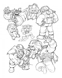
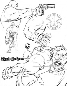
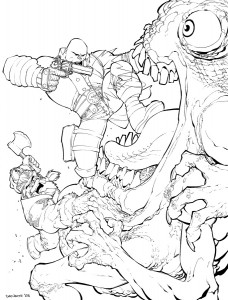
Along with that summary was 4 pages of character sketches by Chris Stevens, helping solidify the ideas presented with his professional quality art:
It’s not perfect, but it is concise. You read it and are well informed about the core concept: These two guys are ass-kicking monster hunters and this series is going to be an irreverent fantasy-adventure romp. Conan the Barbarian meets a buddy cop film. Got it.
(Update May 2015– I’ve recently posted the pitch document for Wayward, my new creator-owned series as well. Check that our HERE.)
In short – The pitch is simple and entertaining. The art helps grab attention, reinforces the concept, and solidifies the whole package as professional-looking and appealing.
Skullkickers is a fun and violent pulp adventure, so that’s exactly what’s emphasized at the forefront of the pitch. None of the other back story elements matter at this early stage. There’s nothing subtle here. The editor can quickly read through and decide if they want more information by contacting me (my contact info was in the header/footer on each page). Ideally they’re hooked but, even if they aren’t they’ll probably appreciate that I didn’t waste their time.
Your story ideas can be scrawled out on dozens of pages. Your scripts can look like telephone books. Your plot and world building can fill giant tomes. None of that matters. If you’re breaking in and want a publisher to check out your idea, you need to percolate all that material down into a bite-sized summary to gain their interest.
Make sense?
Next time I’ll talk more about the different sections of the pitch, ways to stand out and some stuff to avoid.
If you found this post helpful, feel free to let me know here (or on Twitter), share the post with your friends and consider buying some of my comics or donating to my Patreon to show your support for me writing this instead of paying work. 😛





 Zub on Amazon
 Zub on Instagram
 Zub on Twitter

Nice and to the point! Easy to understand without feeling talked down to. Thanks!
This is so…so…so TRUE!!!
I’ve TRIED beating this into people’s heads but without success. They are just too…close to the story.
I’m a pretty good scripter and I try to give advise and help to those who have just started to learn, and I’ve had dudes give me scripts that are over 500 pages long (comic pages long!), asking for help. I’ll ask them to trim it, No Doing. I’ll ask for a good stop and ending point to a story inside the story, after all 500 page script (COMIC PAGES!) is a bit long to read, nevertheless give advice on, especially since I’ve got my own things to work on. It turns out to be 1st part of a three part epic and already has a beginning ending point. 🙄
Never the Less try to get a short..synopsis…out of them… to figure out where they are going with the story.
Artists are worse, I have at least three art friends that gave me a 50 page history of a planet along with race histories (we are talking mesozoic to present) and etc… etc… and I’ll have to have them narrow it down to one character they feel strongest about and one era, mayby then sprinkle in a couple more characters.
I think they just get too…close to the story, they can’t give any of it up. They can’t ‘sum-it-up’.
Just out of curiosity, was this an unsolicited pitch to Image which they accepted without a body of work behind it they were aware of or did you have a history in publishing, specifically with Image?
I’ve been researching pretty heavily of late about breaking into the industry and just came across your blog today. Fantastic. Very informative. PLUS, it also makes me want to read your work. Good job!
Although I worked at the UDON studio before Skullkickers was picked up, Image wasn’t aware of that as far as I know. They picked up the series based on the strength of the pitch.
Image is one of the only comic publishers who actively publish brand new talent. Over the past few years you can see a lot of new names popping up there, many of whom go on to other great projects at Image and elsewhere.
I just went through the pitch process this summer. I was fortunate to have my series, Satanic Hell, picked up by Alterna Comics. I really like your pitch. It captures the feel of the story and conflict beautifully. However, I saw multiple indie publishers who wanted the plot explained in a page – that is not an overview like you gave, but the whole story, its development, and conclusion boiled down to one page. I found that challenging for a seven-issue series. I would much rather have used your style.
Did you also include the cover letter that Image requests?
I did, yes. Like I cover in my final post about pitches, always follow the format requested by a publisher if they list specific things they want:
https://www.jimzub.com/here-comes-the-pitch-part-four/
You mention 5-6 pages between this and the Wayward pitch, but also mention that unestablished creators should include completed comic pages. Should they be included in addition to the 5-6 of the pitch or as a part of that count, and additionally how many would you recommend?
My thought had been to have a summary page, 2-3 character sheets/sketch pages, and 2 completed comic pages taken from the first issue that are a good representative of the whole thing, but I wanted to get an opinion on if it should be more than that.
When I talk about the pitch I just mean the actual summary/character document, not sample pages of the comic itself. Yes, the sample pages are additional. Use as many or few comic pages as you need (from any part of the story, it doesn’t have to be the opening if that’s not the best spot to show what the story is about) to showcase the concept you’re pitching.
Thank you! Truly appreciate all the advice you give to other creators.
Hiii and thank you for this series of posts! I’m working on a pitch document right now and I find myself referring back to these posts constantly! I made a small observation while reading through your pitches that you never mention a character or place by name. Is there a reason for this?
No specific reason, though my pitches tend to take a broader approach in their introduction so that’s why I don’t talk as much about specific characters or places. The Wayward pitch does mention Tokyo and my Glitterbomb pitch talks a bit about Hollywood and Farrah Durante, our protagonist. Every pitch is a bit different so don’t take those pitch examples as the only way to do things or that me not mentioning a character or specific location is some kind of important part of that pitch package.
Thank you! You’re a huge inspiration and I appreciate the time!
Jim, this resource is so helpful! Question — Image asks for a “one page, synopsis of the overall story arc… as succinct as possible… Tell us what sets your story apart from other comics and be clear as to who the target audience is.”
It isn’t clear to me if this should be in the same pitch section or not. Is the “why is your story unique/target audience” section in addition and on op of of your 1 page synopsis (meaning pushing your pitch onto a second page), or, should all this be inside a page? I notice you have “Pitch”, “Overview”, & “Summary” sections. Did Image specifically request this, or, did you take the liberty of doing this yourself to provide your pitch more structure? I’m trying to decide how I can best fit their requirements Thank you for your time!
Image didn’t request the sections that I put together for the Skullkickers or Wayward pitches. I formatted my pitch in a way that made sense to me, clearly explained the concept and gave it structure.
Don’t get obsessed with following an absolute template. I even mention that in my pitch tutorials: “There’s no ‘wrong’ way to put together a pitch as long as your concept is clearly delivered and the editor is interested/impressed by the time they’re done flipping through.”
Image isn’t looking to disqualify a wonderful pitch on a technicality. If the pitch is concise and entertaining with pro quality art, then you’ll have the best chance of breaking through. Their submission guidelines offer advice on how that is usually achieved. My pitch tutorials offer similar info, formatted in a way that’s worked for me as well. Don’t freak out about the technical aspects of the pitch. Make sure the core of it – compelling story, character, art – is what comes across clearly.
Thank you for taking the time to reply! It’s really helpful and reassures me to stay focused on the task at hand. I was concerned they’d throw it out on a technicality, but I’m glad you’re reminding me to make the most compelling pitch possible. Onwards and… Waywards!
Image comics Clearly states that You need 5 pages of Art and a mock up Cover art. Am i missing something? or did you not put it all the way on this post. Or an we get a way with sending 4 pages of character designs (As above) or should be hire the artits to do 5 pages of art and cover?